Email list looking skim?
If that enticing free gift that you created to get people to sign up to your email list is getting treated like 3 week old milk left in hot car – no one wants it – your landing page (or lack thereof) could be the problem.
You see, I see too many brilliant bloggers relying on the fact that since their opt-in gift is free, that’s enough of a reason for people to want to sign up for it. Wrong.
Gone are the days “free” is a selling point, because there is so much free in the world. Like this blog post, or youtube. Free Free Free.
Which why when you’re serious about growing your email list, you need to start “selling the free”.
And the best way to do that?
Getting your freebie a landing page.
In this post we’re going to cover:
>> What is a landing page.
>> How landing pages can help you grow your list
>> Tools for create landing pages
>>> The 7 things to include on your Landing Page to get the most signups
What’s a Landing Page?
 A landing pages is a specifically designed with one goal to get people on your email list. Which means it doesn’t have a menu bar, social buttons or any blog posts around it. It’s just some text, maybe a picture of your freebie and signed up button.
Landing pages are also sometimes called opt-in pages, or squeeze pages (if ya nasty) for the record.
Here’s an example of Claire Pelletreau’s landing page for her Facebook ads webinar freebie. Notice, no menu bar, no share buttons. Just a clean page exampling the benefits of her free class and a button to hit. .
How does a landing page help you grow your list?
Landing pages help you grow your list because potential subscribers can’t get distracted by all of the other amazing things you have to offer like what you posted on your Instagram page or any content that you’ve created recently.
That focused attention means they’re more likely to sign up for your list. This is why just mentioning your freebie in your blog posts, on your sidebar or on your homepage isn’t going to be enough.
Especially if you’re going to want to run any paid advertisement, you NEED to keep blinders on to your visitors so only see your free gift, fall in love it, then sign up, because you’re paying for it.
Tools for creating landing pages

When it comes to creating landing page you have a couple of tech options.
1. Create on your landing page on website using a plugin or theme template
Remember it’s not just enough to slap an opt in form from your email service provider on to a random page of your site. You’re going to want to be able to stylized that page and take away the side bar and menu bar.
If you’re a creating a landing page on WordPress:
The two plugins you want to look at are Divi by Elegant Themes or Elementor. Elementor does have a free option but honestly, I think it worth it to upgrade to the paid version.
Both of these plugins will allow you to create stunning landing pages, in any design style you want, with the extra stuff you don’t want laying around.
If you’re creating a landing page on Square Space:
It’s super
easy to create a landing page using a square space. All you need to do is create a new page on your site using your cover template. This will allow you to directly to connect to either Convertkit or Mailchimp directly.
2. Creating your landing page using your email service provider
An email service provider is the tool that you use to collect store and ultimately email your list legally. One of the key features that you need to find when selecting your email service provider is to make sure that they have complementary landing pages. This makes it easy for you to get analytics and you can skip the tech headache of actually building one for yourself on your website and connecting it.
Convertkit, Flodesk, Mailerlite even Mailchimp all now offer landing pages free with your subscriptions. If you’re not tech or design savvy is a great choice.
3. Use a 3rd party landing page builder to creating your landing page
Your last and most expensive option is to use a third-party landing page builder. These are services like lead pages or optimize monster. Not only do they have hundreds of templates that you can use but they have a boatload of analytics as well.
A lot of people choose to use because the pages will load lightning fast and you can really get fancy on the backend with tagging for subscribers.
The big plus with going with a third-party system is it’s really easy to A/B split test your page. So saying you want to create a landing page for your freebie and you want to test worth you get more signups for traffic coming from Facebook or Pinterest.
With one click of a button you can instantly duplicate your landing page, and get 2 unique urls. One to share on Facebook, one to share on Pinterest.
Now that we know what a landing page is, why you should create one and the tools you’ll need to create one, let’s talk about exactly what to put on your landing page to get the most signups possible.
The 7 Landing Page Must-Haves

#1: Privacy Policy and Terms & Conditions
This isn’t sexy, but it’s NEEDED.
Although we would love to have a captive audience where they had no choice but to sign up for our amazing freebie, GDPR says we have to give our website viewers a way out and off of our page, including a Privacy Policy and a Terms & Conditions page.
If you want to make sure you’re in compliance with GDPR, check out this blog post where Mariam Tsaturyan shares her best tips and gives you some awesome resources.
Even if you’ve decided GDPR isn’t that important and you’re want to take the risk, you’ll need those little links at the bottom any time you are running paid ads from Facebook, Instagram, Pinterest or Google. If you’re stuck, there are a ton of online tools to help you create these pages super-quick and with no stress.
Don’t overthink this part! Just do it. Seriously.
#2: Have A Toe-Curling, Compelling Offer
(Yes, your freebie does still matter).
Way back in the wild-west days of the internet, you could slap a boring headline on a mediocre offer and grow your email list like wildfire. That doesn’t work anymore.
If your freebie is the tir
ed old “5-Step Roadmap to 5 Figures” that sounds just like what every other online marketer was doing 5 years ago, you’re going to have a hard time getting sign-ups, regardless of how pretty your page is or how up-to-date your tech is.
You need to make sure that you’re starting out with an opt-in, freebie, gift, lead magnet… Whatever you want to call it, just make sure that it is actually going to attract your ideal person who is serious about taking action.
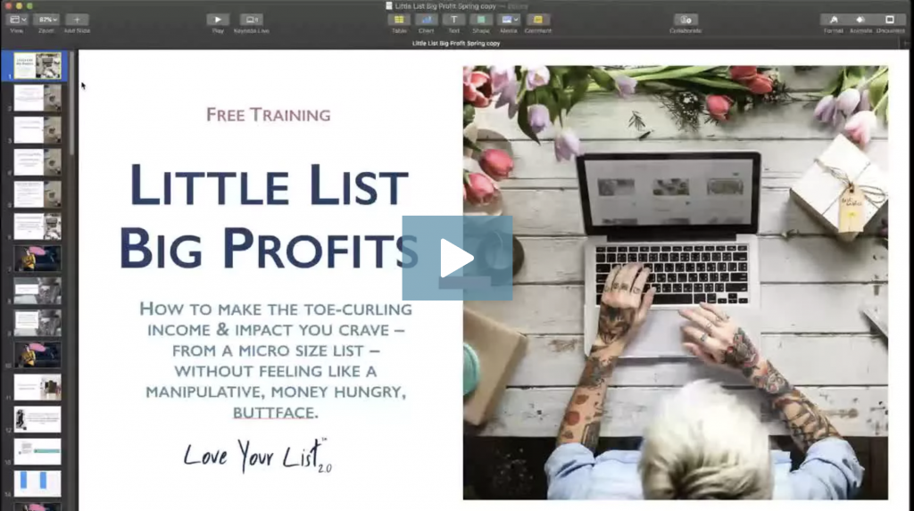
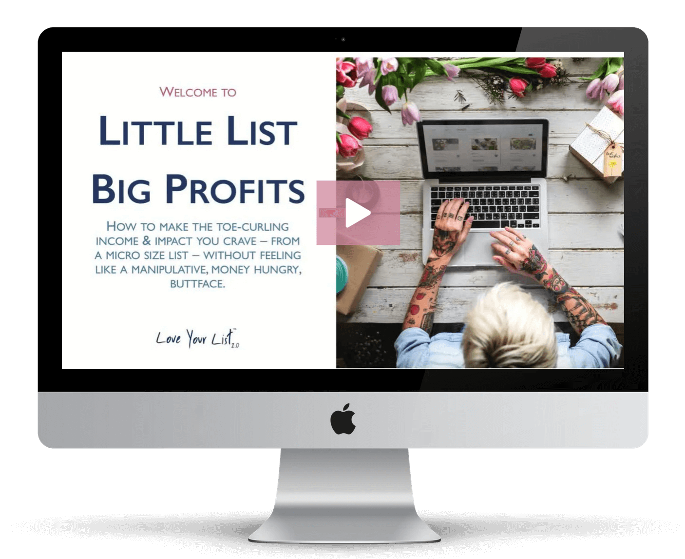
That’s one of the things I cover in-depth in my signature program, Love Your List. It’s no good getting a million subscribers if none of those people are emotionally invested in making changes in their lives. We want people who are committed to solving the problems that our businesses solve, right? We want subscribers who have some skin in the game!
When your offer hits the sweet spot, you’ll have more engagements, more clicks, social media shout-outs and more buyers too. When you start out with a better quality of people, the results you get from your opt-in or freebie are multiplied ten-fold.
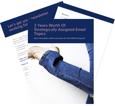
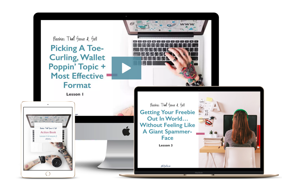
If you’re struggling with how to create your own toe-curling offer, head on over to KateDoster.com/freebies. That will get you a seat in my free mini-course called ‘Freebies That Sell + Serve’, all about how to craft your own freebie that creates fans and buyers for life! If you’re struggling with what to name your freebie,
this blog post has 5 easy-to-follow formulas to help you give it an unforgettable name.

FREEBIES THAT SERVE & SELL MINI-COURSE
Learn how to create, deliever & promote opt-in gifts new subscribers gobble up like candy.

#3: Craft a Scroll-Stopping Headline
Even though this tip is third on the list, the real secret to creating compelling headlines is to save it for last. It sounds counter-intuitive but it works.
Think about it, by the time you’ve created your amazing freebie and written all of your bullet points, calls to action and everything else, you’ve got a ton of phrases and ideas you can pull from to create your unique scroll-stopper.
People will spend hours trying to come up with catchy headlines when their best ideas are right under their nose!
If you don’t come up with something right away, try this trick I learned from a pro copywriter: Write out at least 80 headlines for your landing page. I know it sounds like a lot but like anything, the more you practice and flex that mental muscle, the better your headlines will be. Not up to 80? Challenge yourself to write at least 10 headline variations for your freebie.
There are some questions or prompts you can ask yourself when brainstorming for headlines such as:
- What are some benefits of this freebie?
- What’s the biggest result they can get once they consume this freebie?
- What’s the next biggest result they can get?
- What are some of the ‘yea, but’ excuses your people have?
- What’s a moment they can relate to?
- What can I say to shock people?
For example, if your your strategy is to go for a “shocking” headline, your headline might say something like:
WARNING: Do not scroll down unless you’ve got room to book 10 discovery calls
The reason this works is that it literally shocks their subconscious. They weren’t expecting that. Then, you follow up with what they really want (10 discovery calls). I know it sounds kind of brohimey (is that a word?) but it works.
My absolute favorite type of headline is what I call ‘moments’. Moment headlines are the absolute strongest headline you can use for your landing pages. A moment headline immediately calls to mind a particular moment or mindset that your people can immediately identify with. For example, if your audience is an overwhelmed business owner, your headline might say:
Skip That Wednesday Feeling
When you get a ‘moment’ headline right, your ideal audience knows exactly what you’re talking about. You’ll have instant authority because you’ve put into words exactly how they feel and can relate to them on a visceral level.
If you want to go the extra mile, create a sub-heading (technically called the eyebrow line) that you insert above the headline. The eyebrow line will describe the mechanism or the deliverable of the freebie with a big, bold font underneath with the actual headline, following the formula like this:
Free Four Day Challenge (eyebrow/sub-headline) + Skip That Wednesday Feeling (main headline)
Another great strategy to craft scroll-stopping headlines is the ‘Sir Mix-a-Lot’ principle. I go in-depth on how to use this strategy in the Freebies that Sell & Serve free mini-course but the basic premise is for you to brainstorm what excuses people have for not reaching their goals.
They might say to themselves:
“I want to eat healthier… Yea, but there’s no good grocery stores around here and organic food is soooo expensive.”
or
“I need to build my blog… Yea, but I suck at tech. It’s too hard!”
or
“I want to launch a podcast… Yea, but there’s so much to it, I don’t even know where to start!”
What are some of the “yea, but” excuses your people tell themselves? How can you use that internal dialogue to create compelling headlines? What can you write that makes them think you can secretly read their mind? A “yea, but” headline would look something like this:
Build Your Blog in a Weekend, Even if You Hate Tech
Again, this is just scratching the surface on how you can add the Sir Mix-a-Lot principle to your copywriting arsenal. Go ahead and grab the Freebies that Sell & Serve free mini-course to really understand how insanely effective this strategy can be.
#4: Fascinating Features & Benefits
In the anatomy of a landing page, your features and benefits come right after the big, bold headline. In the copywriting industry, these are called fascinations. They are commonly laid out in bullet points or short, punchy paragraphs that grabs people’s attention.
Simply put, your fascinations are what woo people into action to sign up for your freebie.
The length of your landing page copy or fascinations (or features & benefits list) depends on a few factors. You’re not going to write a 1,000 word landing page for a simple pop-up box and you’re not going to write 10 words for a full-on landing page.
If you’re creating an opt-in trigger, which is a sign-up form that pops up when someone clicks a button, you only have room for a few lines of text. If you are using these or you have an opt-in form embedded on your home page, make sure that your trigger button or opt-in box is above the fold. Above the fold means that they can click the button or fill out the form without having to scroll down the page to find it.
Another thing to consider when writing your fascination is how “hot” the audience is that your landing page is intended for.
A piping hot audience has been on your list for a while. They consistently open your emails. They show up for your live streams on social media. They comment on your pictures. They’re hot. When you’re promoting a new webinar or training to a hot audience, you can cut corners a little bit and not go all-out with a ton of copy whereas with a warm or cold audience, you’re going to need to finesse your words a bit more and pull out you best stuff for your bullet points.
Writing out your benefits and features is easy if you keep the results that your people get once they implement what you’re going to give them.
Remember to go the extra mile and really put yourself into their shoes mentally, touching on those ‘moments’ that speak to your people’s biggest struggles.
When coming up with your bullet points or fascinations, ask yourself:
- What’s unique about your freebie?
- What are some situations your people want to avoid?
- What are the common mistakes people have?
- What can they brag about to their friends once they implement what you’re teaching them?
If you take the time to dig in and do this work, the rest of your copywriting gets super-strong and is way easier to write too!
Ideally, your bullet points will create curiosity about what’s on the other side of that sign up button. You want your bullet points to be crystal clear on what they are going to get while still leaving some intrigue and mystery. I know it sounds like a paradox but this strategy works like gang busters.
Let’s say you have an amazing e-book about weight loss. Your landing page fascinators might say:
In This Slim in Sixty E-Book, You’ll Learn:
- Exactly what to eat to lose weight on page 5
- Learn how to confidently order lunch with the girls without feeling awkward or self-conscious on page 7
- Steal my 10 Minute Meal Plan formula for guess-free meal planning on page 8
Sometimes, it can be as easy as changing out a word with the word “this” or naming your process something unique.
For example:
- Book five discover calls using this
- Thanks to the 3-4-5 Method, you’ll never struggle on a sales call again
If your freebie is a multi-day freebie like an email series or a challenge, focus on the coolest, shiniest, most awesome result from day one as you fascinators.
#5: Create Compelling Buttons
We’ve all seen those lame, standard-issue “subscribe now” buttons. No one wants to “subscribe”. Subscribing is boring.
Use the copy or text on your button to inspire and excite your people to take action. Studies show that by having the default “subscribe” on your button decreases your chances of people actually clicking on it.
Instead of saying “subscribe”, make sure that your button copy is encouraging and takes away from the scariness of what’s on the other side of that click. And remember that being in your energy, being on your list is a privilege! They should be just as excited to click that button as you are about welcoming them to your list.
Some alternatives to “subscribe” are:
- Heck Yea! I’m In!
- Send it to me!
- I Need This!
- Shrink My Waistline
- Talk Nerdy to Me
- I’m Ready for (Result)
If you get stuck and can’t think of anything clever to say, use the “Send My” or “Show Me” Format:
- Send My E-Book
- Send My PDF
- Show Me The Video
- Send My Worksheet
- Show Me The Meal Plans
- Start Lesson One

#6: Visual Elements
Humans are visual creatures. We need to see what we’re getting. We want to connect with who we are getting it from. Adding visual elements like graphics, illustrations, mock-ups and pictures of you helps your people connect with you and your business.
Having a simple mock-up looks fancy and complicated but thankfully, there are online tools that you can use to make it super-simple to create. Smart Mockups and Place-It are just two of the hundreds of websites that take your graphic and put it into a laptop or cell phone to create stunning mock-ups of your freebie.
Another way to include visual elements on your landing page is to create a video of you, explaining the benefits they get from signing up. Your video will instantly create that “know, like, trust” factor when they can see your smiling face explaining to them why you created this amazing resource just for them. Just be sure that you have a good attitude, you’re feeling frisky and you clearly explain exactly why they fill out that sign up form.
Remember that your landing page is the last barrier in between you and the people that you know you could help so much if they would just believe in themselves (and you) enough to click a button. By including graphics and videos, you are assuring them that they are in the right place and you have the solution to the problems they’ve been struggling with.
#7: Proof That it Works
When it comes to crafting your landing page, you don’t need miles and miles of testimonials to prove to your people that you have what they’ve been searching for.
Adding a simple sentence like “Downloaded over 1,000 times” or a screen shot of a social media shoutout can sometimes be all the proof they need to push them over to that sign-up button. If you have them, a written testimonial or two is a nice touch. Testimonials are great because they use the same “real world” phrases and verbiage that your people do.
Another type of proof you can use is a picture of yourself with a short bio. Your picture next to a short bio adds credibility and authority on a subconscious level. Use this as an opportunity to not only introduce yourself and your business but also let them know why you have been called to rescue them from their woes.
Putting a person, a face behind the freebie, is key. Even if your landing page is meant for warm or hot traffic, you still should include your picture with your name, your business and how you help people to keep that connection going.
Personal connections are huge. And they are only going to be more important going forward into 2020. Keep in mind that the best way you can help people is by getting into their inbox. If that means they need to see a picture of you to connect on a personal level, why would you leave it out?
Let’s Wrap Up Landing Pages
There it is. Your crash course on landing pages! A few final thoughts before you go…
Take your time and put some thought behind creating your compelling landing pages. This is how you are going to stand up and stand out in the world of internet marketing. I know it seems like it took forever to create your freebie in the first place. News flash: You DID spend a lot of time creating this freebie. You need to spend time making sure that the landing page does it justice!
Before launching your landing page ask yourself these questions:
- Would I sign up for this?
- Does this make my people feel excited?
- Does it make them feel empowered?
- Does it make my people feel like they’ve got someone on their side?
- Will they think I’ve been spying on them or I can read their mind?
If you can answer yes to all of those questions, you’re going to have a winner.
The anatomy of a landing page is simple:
- Sub Headline (optional)
- Headline
- Fascination or explainer text
- Graphics or video
- Sign up form
- Proof
- Second sign up form
- Picture of yourself & bio